 ES
ES EN
ENHow to interpret the Statistics Dashboard for your Campaigns sent in Doppler
The Doppler Statistics Dashboard provides an overview of the performance of your sent Campaigns. Thanks to this data, you can identify the content that generates the most interaction, evaluate the quality of your Lists and make informed decisions to optimize your future Mailings.
From this panel, you can access key metrics such as deliveries, opens, Clicks, bounces and unsubscribes, all of which are represented in dynamic graphs that make it easy to spot trends in seconds.
In short, this is where you start analyzing results and enhancing your Marketing Strategy with accurate, visual information.
1. Accessing the Dashboard
To access the statistics panel, follow these steps:
- From the main menu, select Campaigns > Dashboard

1.2 Select the time period you wish to analyze, specifying a date range.
This section centralizes the performance of all your Campaigns, making it ideal for comparing results without having to access each report.
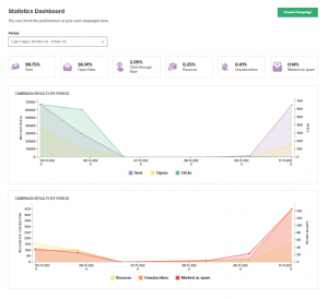
2. Key metrics:
Each Dashboard indicator provides essential information about the performance of your Mailings.
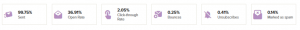
Sent: percentage of Emails that arrived correctly in the inbox.
Open Rate: Percentage of recipients who opened the Email. This enables you to assess the effectiveness of the subject line and the timing of the email’s dispatch.
Click-through Rate: percentage of users who clicked on at least one link. This reflects the level of interest in your content and calls to action.
Bounces: number of Emails that could not be delivered. A high rate may indicate problems with your Database or blocked domains.
Unsubscribed: users who decided to unsubscribe after receiving the Campaign. This is an important indicator of relevance and Segmentation.
Marked as spam: Contacts who reported your email as unwanted. This value should be kept to a minimum to protect your sending reputation.
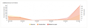
3. Results graphs
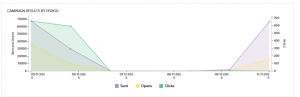
The Dashboard displays information in two main graphs, which are updated every 30 minutes.
- Top graph shows the evolution of Delivered, Open Rate and Click Rate over time. This is ideal for detecting performance peaks and comparing behavior between dates.
Lower graph: shows the metrics for Bounces, Unsubscribes, and Marked as Spam, helping you detect possible alerts or variations in the quality of your Lists.
The Statistics Dashboard is a key tool for analysing and improving your Email Marketing Strategy. 👉Step by step to create successful Email Campaigns
By regularly reviewing these metrics, you will gain a better understanding of your audience’s behaviour, optimise your content and plan more effective Mailings.
If you need help interpreting the results or identifying areas for improvement, please email us at [email protected].
Our team will be happy to help you grow your Campaigns!

Doppler informs you that the personal data that you provide to us when completing this form will be treated by Doppler LLC as responsible for this web.
Purpose: To allow you to make comments in our help center.
Legitimation: Consent of the applicant.
Recipients: Your data will be saved by Doppler and Digital Ocean as hosting company.
Additional information: In the Doppler Privacy Policy you’ll find additional information about the collection and use of your personal information by Doppler, including information on access, conservation, rectification, deletion, security, cross-border data transfers and other issues.